Data is becoming an essential component of daily decision-making and plays a big part in corporate operations today. A cornerstone to understanding anything is excellent data visualization, whether we are ingesting data from others or presenting data to support our decisions.
I have always had a strong interest in data visualization as a data analyst, and I am always looking for new and creative ways to present raw information in a clear and intelligible manner.
But I have also personally witnessed how ignoring fundamental data visualization guidelines can result in confusing and even misleading Raw information .
The advice in this essay is straightforward yet very important. Before you go on to more sophisticated techniques, they assist you in laying a solid basis for efficient raw information visualization.
Use Graphs Whenever Possible
Graphs are an effective tool for data visualization. Consider creating a graph with the raw information rather than just showing it as tables or plain text. This will greatly improve the data’s digestibility and comprehension. Make careful to select the graph type that best fits your data from the many available, such as pie charts, line charts, and bar charts.
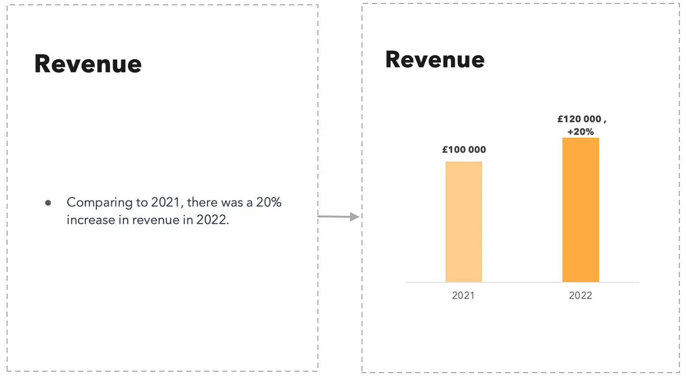
Make Your Data Visible
Use bullet points and make your raw information accessible if you are unable to convey it using a graph. You can use bold type, adjust the font size, and separate enormous figures in thousands of by using commas to make your data accessible.
Do not be scared to draw attention to and enlarge your most significant numbers.
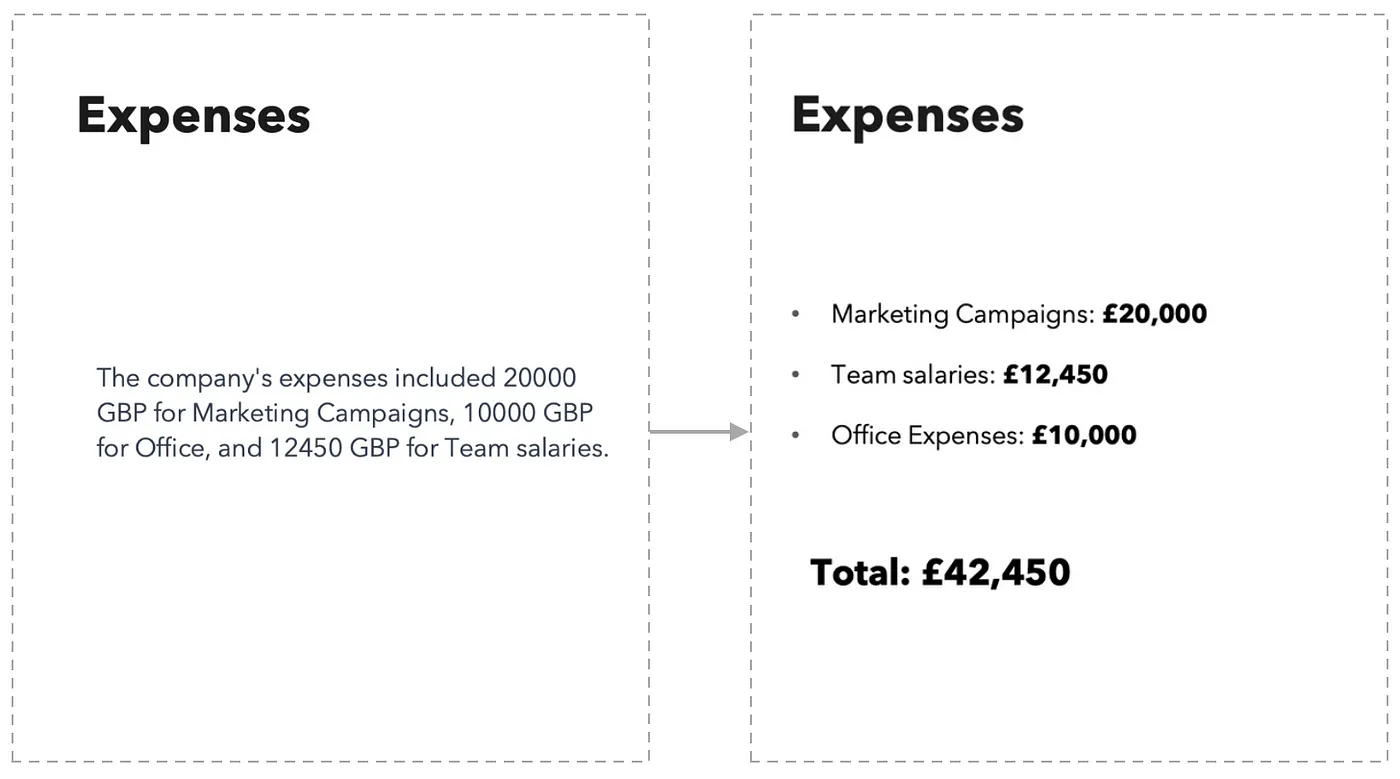
Data Pie Charts Aren’t Always the Best Option
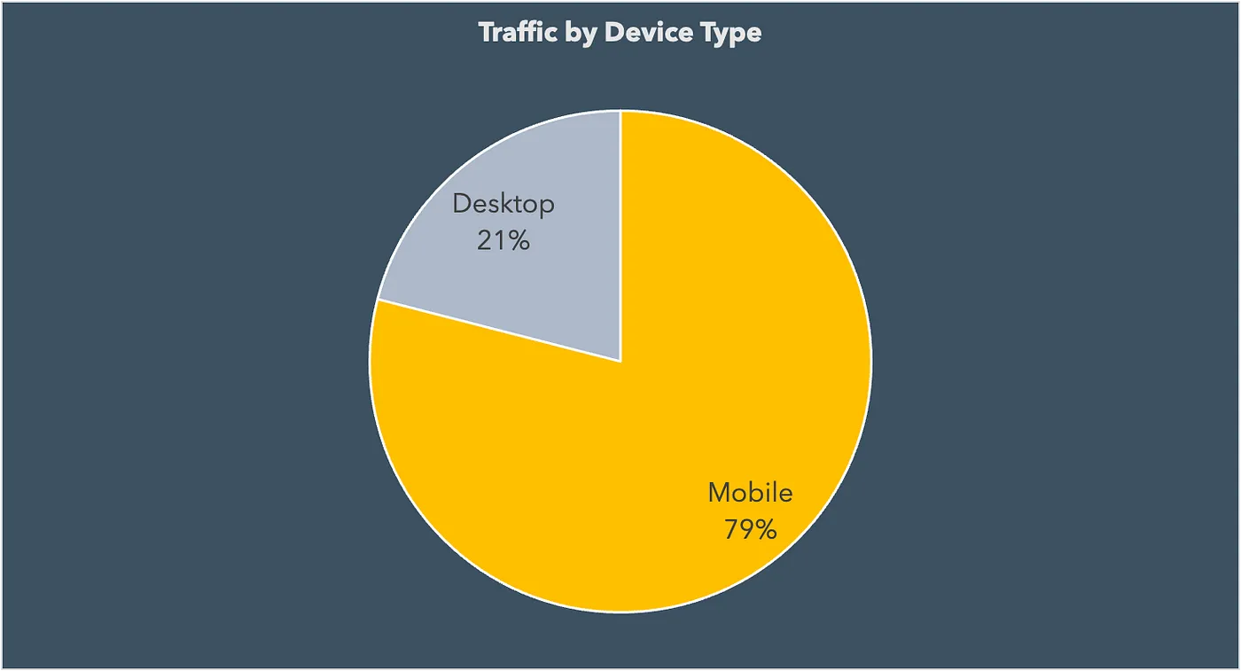
Pie charts are a common tool for data visualization, but how well they work might vary depending on the type of raw information being displayed. Pie charts work well for showing raw information in two categories, but when more than three categories are present, they might be challenging to understand.
Pie charts have obvious limitations, but when utilized properly, they may clearly show which category is the most dominating. Consider the below graphic, which shows the most common type of device for traffic.
The pie chart that follows is an excellent illustration of how challenging it may be to determine which categories have the largest or lowest shares when there are too many in one visual representation.
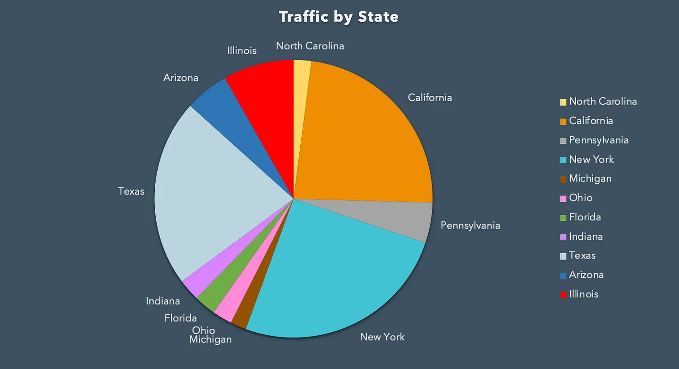
Therefore, if your raw information has more than three categories, it could be advisable to use a different kind of chart.
Data Bar Charts Are Quite Universal
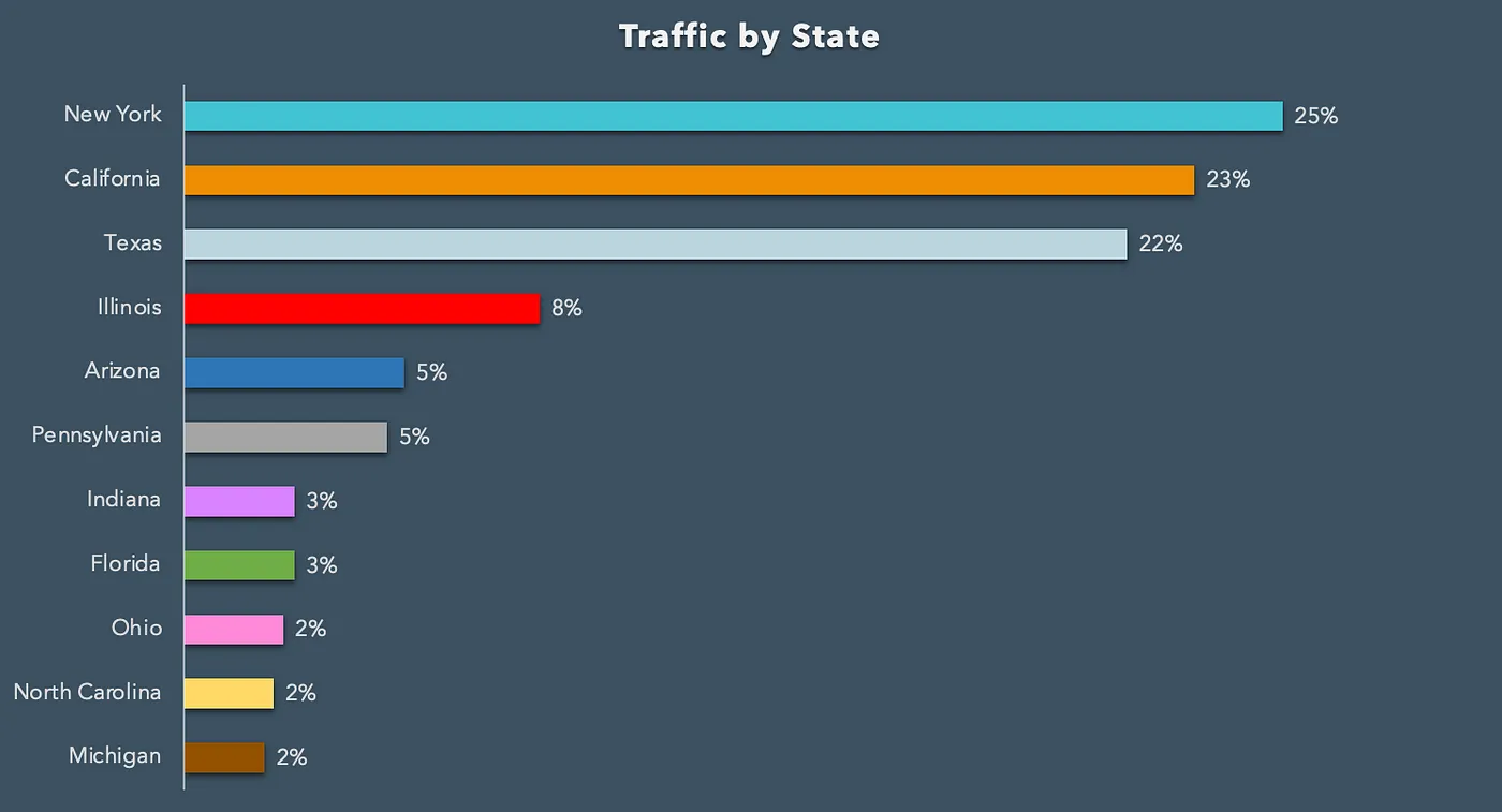
A bar chart is typically a safe option when in doubt. They do an excellent job of succinctly and clearly presenting large amounts of raw information. When there are more than three categories of data, bar charts provide a compelling substitute for pie charts. Make sure the values you wish to highlight are sorted in your bar chart.
Use Colors
Your data can be made more readable and interesting by using color. To draw attention to key data points or to distinguish between groups, use various colors.
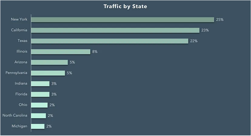
But be out—using too many colors will make your graph appear cluttered. Alternatively, we might use different tones of the same color to distinguish across categories. This can be a useful method to make sure the graph is not too cluttered and is easy to read. Color coding can also be helpful for sifting through aw information values.
Use Colors Logically
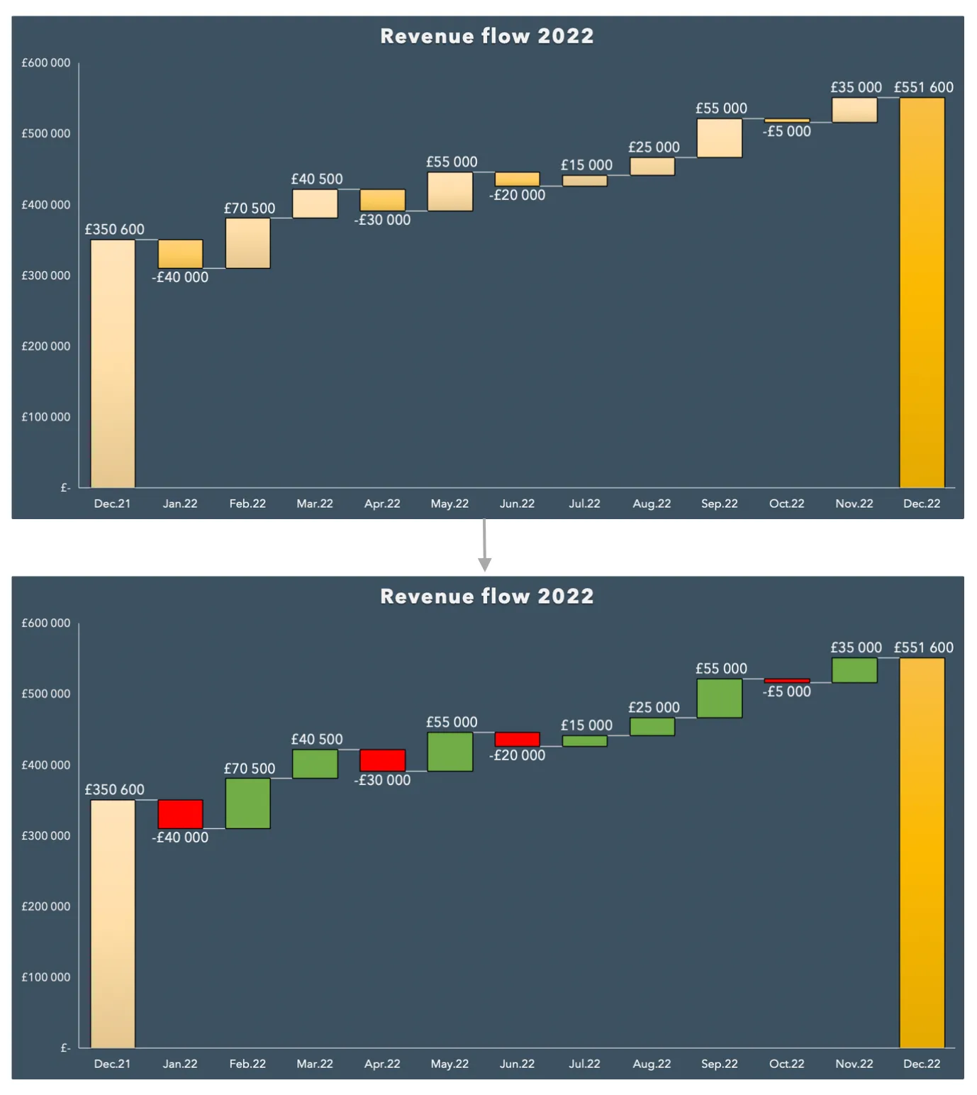
Make sure the colors you choose make sense for the information you are conveying. Use green for positive raw information points and red for negative ones, for instance.
Make Your Data Visualization Look Ready
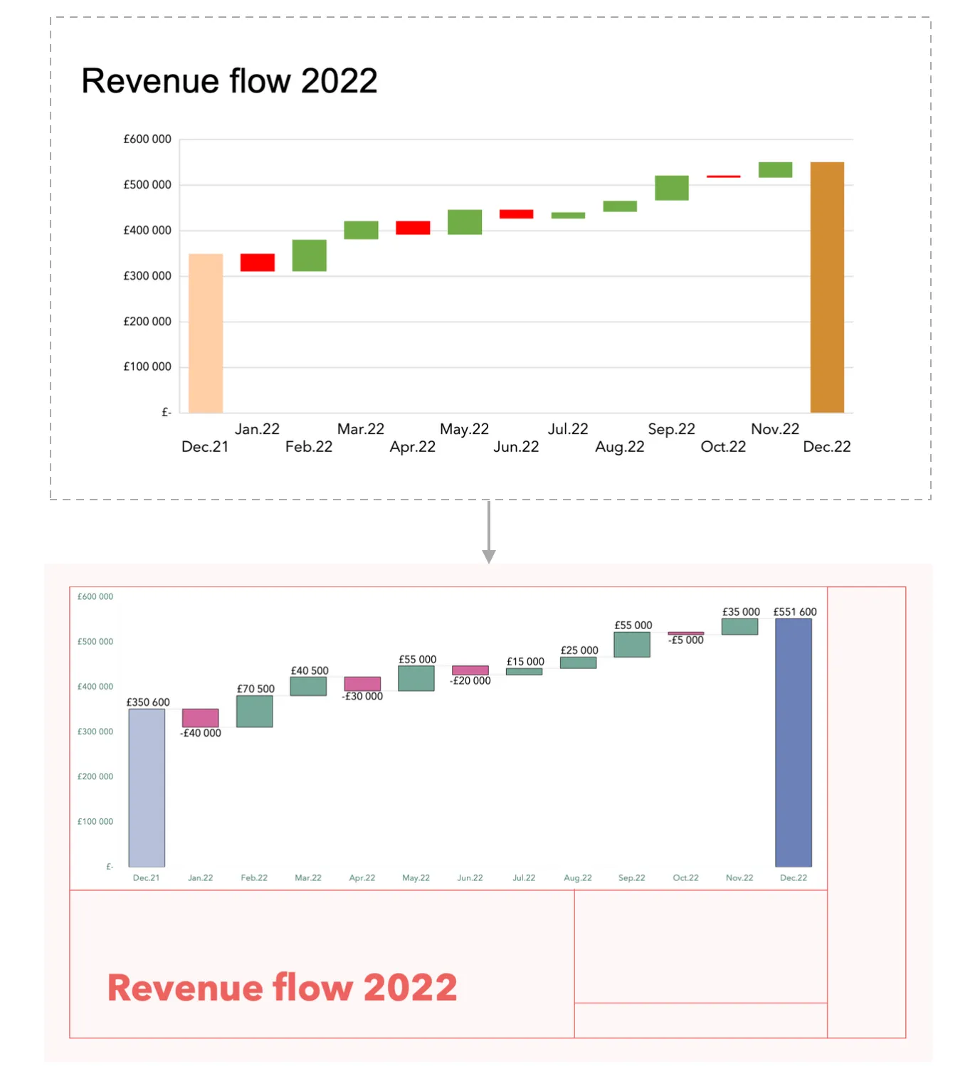
Invest time in making your visualization look professional and polished:
- To make sure that your graphs are readable, use legible fonts and the right size.
- To make the information being presented to your audience easier to interpret, clearly label your axes and raw information points.
- Think about switching to custom visualization settings from the default ones.
- In order to make your graphs visually appealing and consistent with your brand identity, you may also edit them using presentation themes, brand colors, and fonts.
Conclusion
When it comes to making your data trustworthy and easy to understand, data visualization is essential. These easy pointers and techniques will help you make useful and visually appealing graphs that will help you communicate raw information more effectively.
